Not all of the sales growth principles of a brick and mortar store work for online businesses. The client cannot touch and evaluate the real...
Table of Content
- 6. Create a Company Blog
- 7. Optimize Email Marketing
- 8. Add a Buy Button on Social Media
- 9. Encourage Subscribers to Repost on Social Media
- 10. Track Reviews on Aggregators
- 11. Run Contests on Social Media
- 12. Keep in Touch With Your Audience
- 13. Use Hashtags and Mass Following
- 14. Use the Mystery Shopping Method
- 15. Accompany The Client on The Website
- 16. Prepare an Intuitive Interface
- 17. Make Responsive Design
- 18. Simplify The Registration Process
- 19. Use Contrasting Colors
- 20. Find the Right Product Prices
- Five tips for smart pricing:
- 21. Add a Signature About The Company's Activities Next to The Logo
- 22. Add a Company Phone Number
- 23. Set Up a Convenient Product Search
- 24. Add Real Customer Reviews to Your Website
- 25. Set Up a Chat With a Manager
- 26. Give an Opportunity to Call From the Site
- 27. Give a Free Trial or Product
- 28. Write Marketing Headlines
- 29. Explain to The Client the Need For The Product
- 30. Write Texts For Quick Reading
- 31. Introduce The Product in Detail
- 32. Make The Cart and Buy Buttons Tasty
- 33. Customize Your Cart
- 34. Offer an Additional Item
- 35. Prepare a Loyalty Program
- 36. Analyze Customer Behavior on The Site: What you Liked
- 37. Analyze Customer Behavior on The Site: Which Pages are Often Left
- 38. Offer Free Shipping
- 39. Give a Gift to a Client's Friend
- 40. Send a Gift for Purchase
- 41. Collect Reviews Yourself
- 42. Make a Content Plan
- 43. Enter Free Return
- 44. Use Situational Marketing
Not all of the sales growth principles of a brick and mortar store work for online businesses. The client cannot touch and evaluate the real type of product or service. But it is much easier for him to get into the online store; he does not even need to get off the couch. It's much easier to start selling online. I created a product, made a website, went out on social networks - and is already ready for sales. The competition is higher; it is more difficult to declare yourself, to break into the leaders. We have collected 44 ways to increase sales, tested on the real experience of large online stores. Source
STAGE 1. ATTRACTING A CLIENT
1. Set Up Social Media Ads
The modern way to reach a client is to advertise on social media. It looks so simple: I drew a picture, wrote down the text, attached the Buy button, and finally "leaked" the budget.

1. Explain how to interact with ads. Clients may not understand how to work with ads.
Especially with the one that is embedded in the news feed. Point to the "Buy" button, write in the text where the potential client should click. Clearly explain how to interact with your ad.
2. Make a catchy creative. A bright and tasty picture is the key to the attractiveness of the campaign. Creative should catch the eye but not annoy it. Boring, trivial images are just as bad as "wry-eyed" creatives. Try to adhere to the design and style rules of your site.
3. Don't use a lot of text. An abundance of text makes it difficult to focus on the product. The sentence should be clear and easy to read.
4. Check how the ad will appear. Additional icons that will be visible when serving ads should not overlap important details of the creative. Close button, age limit, all this should not interfere with your message's perception in advertising.
5. Don't lie to the client. Advertising from the series "You will look two sizes slimmer in this dress!" is already tired of all and will bother for a long time. Perhaps your product is slimming. But it hardly works universally for everyone, right?
2. Choose The Right Target Audience
The first thing a novice business person should do is to determine the target audience of his project. Without a clear portrait of the client, it will not be possible to build a competitive positioning of the company, and the advertising budget will "merge".

How to find your buyer? As always by trial and error. At the first stage of determining the target audience, you can limit the approximate circle of stakeholders. For example, subscribing to online games is primarily of interest to a young audience and, to a greater extent, the male part of it, while online clothing stores focus more on girls over 20 years old.
After a rough selection of the audience, it is necessary to draw up the most accurate portrait. How to do it?
1. Analyze what your competitors are doing. Where do they distribute their product? How are they positioned? Who is following their social media groups?
2. Gather focus groups. Recruit several groups of people of different ages and genders. Introduce your product to them and determine to whom the product or service seemed interesting, who is ready to purchase, in what form, and for what price. Simultaneously, you can identify what positioning of the company can make the product interesting for non-targeted traffic. It will help to expand the company in the future.
3. Give advertisements to everyone. Then analyze who most often clicked on your offer, went to the site, and performed the targeted action. Next time, target your ad to a dedicated audience to test your results in the first experiment. Adjust the portrait of the target customer, depending on the conversion rate.
The process of selecting the target audience can take several advertising campaigns. You not only have to pinpoint the age, gender, and geographic boundaries of your audience but also define its values, desires, and fears. Then you will be able to position your business at all possible sites correctly.
In 1988, RJ Reynolds cigarette company began producing smokeless cigarettes. It made it possible to protect bystanders from secondhand smoke. True, the taste of cigarettes was so unpleasant that the target audience, namely smokers, did not accept the product. As a result, the idea burned out.
3. Set Up Search Engine Ads
4. Six Rules of Good Search Engine Advertising
1. Unique title. The client types a request in a search engine; in response, he receives several identical answers. How to choose among them?
2. Be honest with the client. Promise high quality, stick to it. Lure with low prices - the buyer should see them on the home page.
3. Track lead generation conversions. Visitors must complete the targeted action, not just see the site.
4. Segment and test. It is not always possible to reach the interests of the audience as successfully as possible.
5. Filter out non-targeted traffic. Most likely, a first-year student is not interested in advertising for luxury furniture. Therefore, indicate in your ad for which audience segment you are working.
6. Pick the right keywords. Go to Google. Words that ", enter a word or phrase that represents your activity. For example, "selling furniture". Two lists will appear. On the left - clarifying questions, on the right - similar queries. Repeat with all the ads you are interested in.
5. Work With Bloggers
The interaction of the company with the blogger brings the target audience necessary for the business. She is initially loyal to the brand because she has similar values to the blogger and agrees with his opinion. It is crucial at the preparation stage to select a blogger with an audience that is as similar as possible to yours.
A successful collaboration with a blogger cannot be direct advertising of a product. It can be advice, feedback, and any other activity that will not shout, "Buy! Buy it! "
Top YouTube blogger Sasha Spielberg has collaborated with the Marmalade brand. The girl herself developed the design of clothes and accessories and included elements of her collection style. The blogger then told her viewers about the products, including sneakers with glowing soles. The loyal audience of Sasha Spielberg positively evaluated the effect. As a result, already in the first week, Marmalato sold more than 10,000 pairs of shoes.
Advertising with novice bloggers will be cheaper. However, at the beginning of his creative career, one must understand that a blogger may misunderstand his audience or start advertising any goods. You run the risk of getting less return than you expect. Therefore, it is essential to find "your own blogger."
6. Create a Company Blog
The blog will be useful for search engine optimization: search engines better rank sites with content. Advertising in the search engine is expensive, and it will be easier for potential buyers to get to you with a targeted query.

For example, online apparel retailers may post "what to wear this summer" articles. Potential customers will find the item in a search engine, read the text, and at the same time, leaf through the seller's website.
With the help of a blog, a company can tell about new products, describe the products offered on the site, and highlight topics that are interesting to the target audience.
In our blog, you can find materials that talk about the functionality of a CRM (for example, how the digital funnel works and what are its advantages), tips for an interested audience (entrepreneurs, marketers, project managers), cases for working with our program, and more useful information from the field of business and sales.
7. Optimize Email Marketing
Remind the customer about the company and the product in every possible way to make purchases again.
It is best to follow the example of Mosigra. The company does not send direct annoying sales letters to the client. Instead, newsletters receive exciting stories that are sometimes not even directly related to products, but which will be interesting to read by the target audience. At the end of the letter, it is told about the week's products, which are currently at discounts.
Which mailing format is most interesting to the audience is determined by testing. Do split tests, A / B tests of each letter, analyze which topics contributed to the greater opening, and after which letters clients were massively unsubscribed from the mailing list. Check which calls to action motivate the purchase better.
8. Add a Buy Button on Social Media
Facebook has a positive attitude towards business accounts; in particular, entrepreneurs can set up a button to go to the site to purchase goods. No reason not to use it!
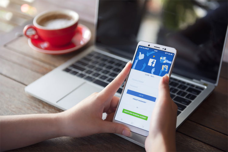
A subscriber or someone who accidentally comes in will not have to figure out how to purchase your product for a long time to see the full range. It will speed up the buying process.
Additionally, include links to all landing pages: the store contact page, the company blog with helpful tips.
9. Encourage Subscribers to Repost on Social Media

Encourage subscribers to repost posts in your accounts. How will this benefit you? Free advertising: each repost increases your audience reach.
10. Track Reviews on Aggregators
Reviews on aggregators can become an additional advertising resource, but at the same time, they can damage the reputation of a business. Therefore, they need to be monitored and responded in time.
What does it do for your business? Detailed reviews from real buyers will show entrepreneurs the strengths and weaknesses of the product. Negative reviews need to be answered so that future buyer can see that you are working and are ready to change for the better.
11. Run Contests on Social Media
Contests, mostly with simple mechanics and guaranteed prizes, help increase the reach of people who will know about the account and the company. The more people find out about the product, the more purchases will be made.
Some participants will not want to wait for the end of the competition and hope to win. They will purchase the product before the end of the activity.
What is important to consider when conducting a contest on social networks?
1. The rules must be written. In case of any questions regarding the competition results, the organizers can show which particular points of the rules were not met or were performed incorrectly.
2. match the value of the prize and the mechanics of the competition. No one will record a competition video with your company name and the correct tags for a notebook. But for the notebook signed by the group Imagine Dragons - people will be ready to work a little.
3. Make the determination of the winner transparent. Record the winner's selection on video and use a random number generator so that subscribers do not think that you have chosen among the same names.
12. Keep in Touch With Your Audience
Do not forget to answer questions in the comments, work with negativity and objections - be in touch with your clients. If you have a small business, you might even subscribe to some buyers. Like them, write non-standard comments. For you, this is just one more way to remind you of yourself, and the client is pleased.

Every month, some online stores spend thousands of dollars on sweets among customers who posted photos of the products on social networks.
13. Use Hashtags and Mass Following
Maybe hashtags and mass following no longer bring the results they could have provided 2 - 3 years ago, but they remain the cheapest ways to promote and be useful for young companies in the early stages.
Hashtags allow you to find new, initially loyal subscribers. Look at users' posts with the tags you use most often, like photos, subscribe to an account - let people know about your business.

Once your company account is well promoted, start typing your tags. Let them contain the name of the company or a reference to the main product. Gradually, subscribers will begin to use these tags in their posts and advertise the company's account.
The main goal of mass following is not to increase the number of subscribers but to attract them to view your page. The more people know about the product, the more buyers there will be.
14. Use the Mystery Shopping Method
Are you a business owner or sales manager? Try to take the place of the buyer - talk to the managers of the company yourself. So in practice, you will realize what could be corrected at work.
When sales of KP Britannica began to fall, the commercial director decided to analyze the work of the employees using the "mystery shopping" method. First, the company's manager called competitors and highlighted mistakes in their work; then, it was done about his company. Based on the check results, typical errors of managers were highlighted, new scripts were drawn up, and additional training was carried out to communicate with clients.
STAGE 2. WORKING WITH A POTENTIAL CLIENT
15. Accompany The Client on The Website
The advertisement worked; the client went to the site. Now we need to motivate him to stay. Then collect his data, push him to increase the order amount, speed up the decision-making - you need to force him to perform targeted actions.
How to do it? Accompany the client's steps with various motivating messages. The visitor has entered the site - offer him a special discount. Long looks at the page - show the chat with the manager, where you can ask any question. Made a purchase - there is no reason to be silent about the loyalty program!
To keep a bunch of messages from bothering your site visitor every second, adjust your sales funnel. Make clear conditions for each step. After targeted actions, the site will show additional widgets to help the customer move towards the purchase. Every hint will be valid and helpful.
16. Prepare an Intuitive Interface
Ideally, the client should understand the navigation of the site in a few seconds and be able to return to the main page with a maximum of two clicks. The adjacent elements should have clear boundaries. The client should not click on one button but move on to another.
Test the site with friends. See if there were any difficulties when making a purchase, at which moments the person could not immediately understand how to perform the next action.
17. Make Responsive Design
Today, there are so many devices that you can use to access the Internet that it's even strange to see sites without responsive design. If a client comes to your page from a mobile phone and continuously peer into small text and enlarges the page, will he buy many goods?
For the online store, the transition to adaptive layout ensured an increase in the number of customers by 10-15%.
 If there are no resources to create a responsive design, make the site's layout as convenient as possible for viewing from any device: the target elements, for example, a phone number, should be clickable but not tightly pressed against each other.
18. Simplify The Registration Process
When entering the site, it is better not to require registration at all. A potential client still does not even understand if there is a product he needs on the site, but personal data is already required. Instead of registering, offer the client a unique discount, sent to him by email or newsletter subscription. You have collected contacts; the client is happy with the bonus.
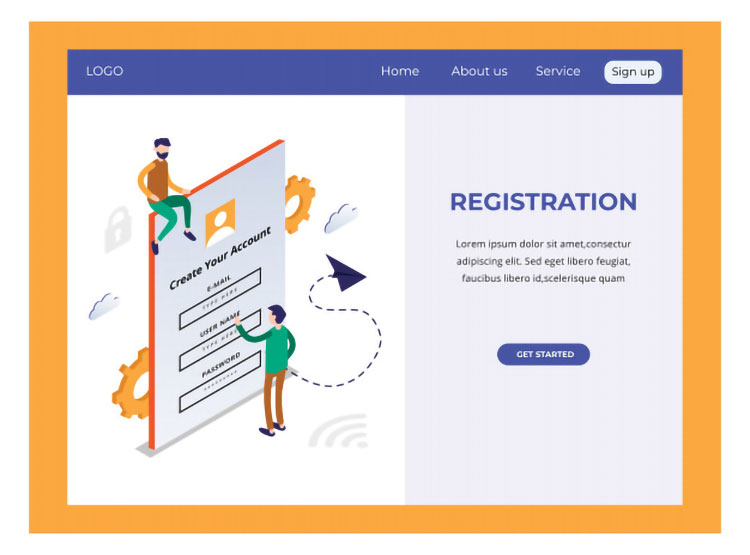
There should be only a few questions in the registration form: name, post office, city. You can ask for a phone number. Specify more detailed information when the client is ready - when placing an order after filling the basket.
19. Use Contrasting Colors

Buttons, active links, the text should not merge. Otherwise, it will be inconvenient for the client to use the site.
20. Find the Right Product Prices
You may have a product that everyone needs, but the high price will scare customers away, and the deals will not be completed.

Five tips for smart pricing:
1. Do market research and find out the prices of your competitors' products. To stand out favorably against their background, offer more functionality for the same price, or set the amount lower than other companies.
2. The high price gives the impression of a high-quality product. Having delivered a high value of the item, be prepared to meet the customer's expectations.
3. Low price, on the other hand, can create a feeling of low product quality.
4. The price is directly related to the value of the product for the buyer. If you can convince your customers that the product is premium, set the price corresponding to this definition.
5. Customers are willing to pay more than usual for branded products.
Add a signature about the company's activities next to the logo
21. Add a Signature About The Company's Activities Next to The Logo
A signature that explains the activities of the company will help the user navigate. The client requests a search engine, sees the site, follows the link, and spends a few seconds thinking about whether this online store is right for him. If a visitor does not immediately understand which site he has come to, he will look for the desired product elsewhere.

What do you think each of the companies below is selling?
Both sites sell fixtures in one form or another. There is no need to think about the first site - just under the logo is the designation of the activity. In the second case, the site is initially perceived as a decor store, not lamps. A potential buyer may decide that he is in the wrong place. Or, on the contrary: they will come to the site for stickers on the wardrobe and, having spent time looking for decor, they will not find the necessary decoration.
First of all, site visitors look to the upper left corner, as people are used to reading from left to right, top to bottom. Therefore, it is best to place the company logo and signature there.
22. Add a Company Phone Number
The client cannot touch or evaluate the actual appearance of the product. He may have doubts and additional questions about the product. Communication with the manager will help remove a potential buyer's suspicions and allow you to understand what information is missing on the site.

Internet users are already accustomed to seeing phone numbers in two places on websites: on the right at the very top of the site and the bottom at the very end of the page. The phone number located at the top is visible to the visitor immediately upon entering. The number below is needed so that the client can call immediately after reading the text on the page, without going back to the beginning.
It is important to consider that customers can visit the site from mobile devices. Therefore, it is better to make the phone number in text format and not put it in the picture. This will allow visitors to click and call immediately.
23. Set Up a Convenient Product Search
The client may not know how to spell the name of the product he needs. And it can also be sealed, forget to change the keyboard layout, and much more.
Ideally, the search engine on the site should recognize all such cases and provide the client with a list of products, even if they request errors. For example, the QUELLE catalog for the request "sneakers" gives a slightly wrong product.
Another bad option is empty results. The client types the name of the required product, receives a response from the system: "This product is not available." However, there is such a product on the site.
The search for the desired product will be facilitated by filters, which will make the client's stay on the site more comfortable.
The division of products into categories and a separate division of products by brands with which the online store cooperates will facilitate the search for those who want a particular type of clothing and those who exclusively trust specific brands.
24. Add Real Customer Reviews to Your Website
The opinion of people who have already used a product or service from the site will understand how the product suits the needs of the client.

Make authorization on the site through social networks. This, firstly, will reduce the time spent by customers for permission, and secondly, it will create trust among potential customers. If desired, the buyer can personally communicate with the author of the review and find out all the "pitfalls" of the acquisition.
Reviews with authorization via social networks and a gallery with examples of work helped the Voodoo Studio website development business increase orders by more than 25%.
You cannot delete negative reviews. Their presence will increase the company's level of trust, and a thoughtful, timely response will demonstrate the quality of service. It is also a good platform for responding to criticism.
25. Set Up a Chat With a Manager
The chat will support the client on the site, help collect a database of contacts and frequently asked questions.
The introduction of an online consultant widget helped the Uncle Baroda online store to increase sales by 30%.

- It opens half a page and interferes with getting acquainted with the product.
- Messages from the bot come with an annoying sound or with the sound of messages from social networks. Do not do this.
- You cannot get an answer in the chat. You can only leave your phone to call back. This is cheating; you better make a separate widget for calling the client.
- Chat advertiser. When a customer clicks on it, a transition to another page occurs. This is the most unpleasant thing to do for a client.
26. Give an Opportunity to Call From the Site
The client has a question, but he cannot call. Or doesn't want to. Well, then he can make an online call.

A call from the site will make communication for the client free and accessible from almost anywhere with the Internet.
The ready-made widget can be purchased, for example, from Callback Hunter. Indicate the urgency of the purchase
A call-to-action buy now will help reduce the time it takes to decide to purchase or re-purchase. The most common ways to do this are:
- Discount on goods on certain days. The MediaMarkt technology store offers discounts on the site that are valid for a particular number of days.
- Limited time shopping cart. If a customer on the ASOS website does not have time to complete a purchase within an hour, his/her cart will reset to empty.
27. Give a Free Trial or Product
The client is not sure how the service suits him. Not a problem! You can try the service for free. During the use period, the client gets used to using your product and purchases a subscription to it.
 Upon first use or after updates, Adobe programs give customers seven days to try out how the program's functionality works. The client tries to do the first project. If the system suits him, he will start preparing new projects. After the trial period ends, you will have to buy a subscription to complete the work you started.
28. Write Marketing Headlines
A rule that usually doesn't need to be reminded. However, the question arises: how to make a good headline that will attract the audience?

Kissmetrics founder Neil Patel analyzed posts on his blog and noticed that there were meaningful headlines - for example, "How can a young project find investors using Instagram?" - perform better in the long run. Posts with such headlines are shared 29.1% more than posts with vague headlines; they stay in high positions longer and get 62.5% more traffic on social networks. But posts with obscure titles like "How to get rich?" - receive 44% more traffic from the mail.
Try to make several texts with different types of headings. Analyze which of them attracted customers more often. So you will find the best option for your target audience.
29. Explain to The Client the Need For The Product
Explain how your product can be useful to customers and why it is generally needed. This will help reduce the time for making a purchase decision, but casual visitors to the site will get acquainted with unfamiliar products. Focus on the main product
Do you offer any products or services on the home page of your site? If so, we advise you to check if this is good for your sales.
Instead of forcing customers to understand the abundance of offers, put a top product on the start page with detailed text about the product's properties and benefits. A new collection is brought to the main page in online clothing stores in electronics stores - seasonal offers.
30. Write Texts For Quick Reading
People do not read but "scan" the text on the Internet, taking out only important information for themselves. Pay special attention to the top left. According to Chartbeat and Slate's heat chart, the areas that users view the most are F.

- Users want to quickly familiarize themselves with the product and realize its practical value for themselves.
- Aligned to the left. Uneven line endings on the right make reading more accessible and faster.
31. Introduce The Product in Detail
The buyer's fear of buying on the Internet is associated with the inability to examine, touch, try on the product carefully. Customers have no doubts, make a photo gallery of the product and its detailed description.
Revenue from Obuv Rossii online stores grew by 37% in the first quarter. In the fashion article, Sofia Makarevich, the head of the company's Internet sales, names the website content's improvement is one of the reasons for the revenue growth. Stores have improved product descriptions, added photos of shoes on models, and increased the number of products with 360-degree images.
Here you can also pull up photos of the product that your customers have posted on social networks. At the bottom of the page with the product, the comments of site visitors will logically fit.
Online clothing store ASOS shows customers short catwalk videos, which allows them to see the goods better.
32. Make The Cart and Buy Buttons Tasty
And they are also attracting attention. The client will focus on what he went to the site for - buying a product. The client doesn't have to search for the right buttons for a long time.
The example shows a not very good button design. It merges with the buttons for selecting product properties. The client's gaze is not focused on the target.
33. Customize Your Cart
It happens like this: you type a long purchase into the basket, look for the necessary goods, and then again! The Internet went off, or something else prevented the completion of the purchase. I don't want to waste a lot of time filling the basket again
Different difficulties do not prevent customers from purchasing goods and set up automatic saving of the cart. If the buyer changes his mind about making a purchase, he will empty the cart independently.
34. Offer an Additional Item
After a customer orders an item, show them a cheaper item that can complement the purchase.
Vasily decided to order boots for his wife on the website of a well-known online store. When the selected pair went to the virtual shopping cart, a list of products appeared on the screen to help in shoe care. "Wow!" - Vasily exclaimed. And five more items went to the shopping list.
Selling additional products will increase the average check.
Similar products
Let's say your online store has run out of a specific size of a dress, and a client urgently needs to buy it. In order not to lose the customer, offer him an alternative - a similar product.
In addition, an offer to purchase a similar product with a higher price can help increase the average bill. Initially, the customer may simply not have seen the other product.
STAGE 3. REPEAT SALES
35. Prepare a Loyalty Program
Agree, it is more pleasant to return to the store again and again when any next purchase will be cheaper than the previous one.

Food Delivery Club gives points for a particular purchase amount. Customers can then exchange the accumulated bonuses for food. Important note: if you do not complete orders within six months, all accrued points will expire.
Soft restrictions in loyalty programs do not cause any negativity but motivate to buy more. If to maintain the discount or points, the client does not have to strain too much and spend large sums, and at the same time, the product or service will be performed with high quality, the client will be ready to register in the program.
36. Analyze Customer Behavior on The Site: What you Liked
Analytics programs will help to understand the popularity of pages: - for example, Google Analytics.
Open the Behavior section in Google Analytics. Track traffic analysis, login pages. Analyze search queries on the site.

Identify the source of traffic. Find out the time elapsed since the last visit. Separate the visits in which the conversion took place from all the others.
The most popular pages will help to adjust the focus and positioning of the company. Login pages will tell you which products or services are most attractive to your target audience.
37. Analyze Customer Behavior on The Site: Which Pages are Often Left
Pay attention to the pages after viewing which clients most often leave the site - they need to be reworked. Think about what the page is missing? Is the design straightforward? Is the text written in sufficient detail? Does the information meet customer expectations?
Vasily went to the site of a local pizzeria. Before choosing a product, I decided to inquire about the terms of home delivery of pizza. The delivery geography was mentioned somehow in passing; the cost was not indicated - Vasily was upset and left the site.
It takes a few minutes to analyze the exit pages. Open Google Analytics. In the "Behavior" section, select the "Site Content" tab. View Exit Pages.
Install the counter code on all pages. Monitor how customers behaved and what pages they viewed before leaving the site.
38. Offer Free Shipping
This option is attractive because you don't have to spend money on top of the item's cost. Free shipping can motivate a customer to buy more.
In the ASOS online clothing store, standard delivery will be free for purchases from $25 USD, express delivery - from $100 USD. Otherwise, you will have to pay for delivery. It motivates the customer to buy more items, although the total purchase amount may be higher than the initially selected item's price with delivery.
39. Give a Gift to a Client's Friend
Clients often share information about a purchase with their loved ones: they brag about a new purchase, talk about life hacks of shopping on the Internet. To manage this process, an online business can offer a customer a gift for a friend: a discount on the first order, a free additional service, a purchase coupon. At the same time, you can use the gift only under certain conditions.
Uber taxi service invites customers to share with a friend a special promotional code for registration. Both users get a discount on the ride. The recipient of the code can take advantage of the discount already on the first trip, and the sender only after his friend uses the service for the first time. This promotion is always valid, which means that More friends - more discounts.
A friend's gift is useful to all three parties: users get a discount or additional service, an online store - a different client.
40. Send a Gift for Purchase
A small present for the client, which he will receive along with the purchased product will make a pleasant impression of your company.

The AliExpress online store's sellers often put some unexpected small gifts for customers: socks, a postcard, stickers. Since customers leave their reviews and ratings for the seller under each product, the gift makes the buyer happy. It motivates not only to leave a good review on the site but also to tell his friends and subscribers about the purchase on social networks. In addition, such a gift can somewhat smooth out the negative impression if something happened to the goods upon delivery.
As long as the business is small, you can make personalized gifts for every customer. For example, attach a hand-signed postcard upon delivery. A unique gift always evokes positive emotions and delights customers.
41. Collect Reviews Yourself
You can periodically call customers and ask their opinion about the product. This will show that you care and will be able to respond to the negativity that has arisen.
To make customers more willing to contact, offer them a discount or gift for taking part in the survey. Thus, you motivate the buyer to buy again.
42. Make a Content Plan
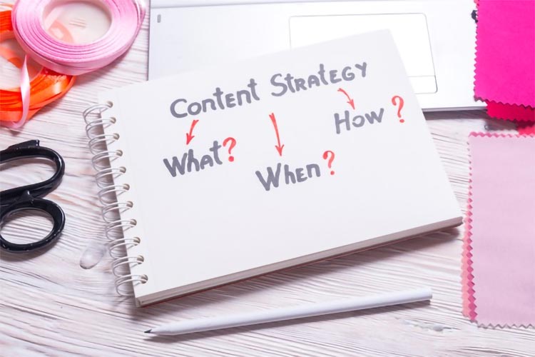
The constant content of social networks helps increase the number of subscribers and, consequently, reach. Test the target audience's reaction to page updates and set the optimal frequency for their perception, with which the public will not lose interest in the company.
43. Enter Free Return
If your store is big enough, allow customers to return unsuitable items for free. Then customers will be more accessible and relaxed to shop.

The online store of a major Nike brand allows customers to return unsuitable clothing or shoes for free. Customers are less afraid that a purchase might not be right for them.
44. Use Situational Marketing
Try not to forget about situational marketing. This will collect more likes and reposts and increase coverage. Most exciting events can be prepared in advance. It only remains to post the post in time.
Aviasales responded to the blocking of the Pornhub resource. Made the interface in the style of a blocked site. This amused the public and got into various media, repost in social networks - in every possible way, increasing the coverage of the campaign.


